Choosing the right colors for living rooms isn’t just about aesthetics: it’s a science. With the right hues, a bland space can become your family’s favorite hangout spot. Conversely, a misstep can lead to a room that feels more like a doctor’s waiting room than a cozy retreat. But fear not. This guide will investigate into color psychology, popular palettes, and tips to harmonize it all, while keeping you entertained. If you think choosing paint is about as exciting as watching grass grow, wait until you see how vibrant your space can be with the right colors.
Understanding Color Psychology
Color psychology plays a significant role in how we perceive spaces. Different hues evoke various feelings and emotions, affecting mood and atmosphere.
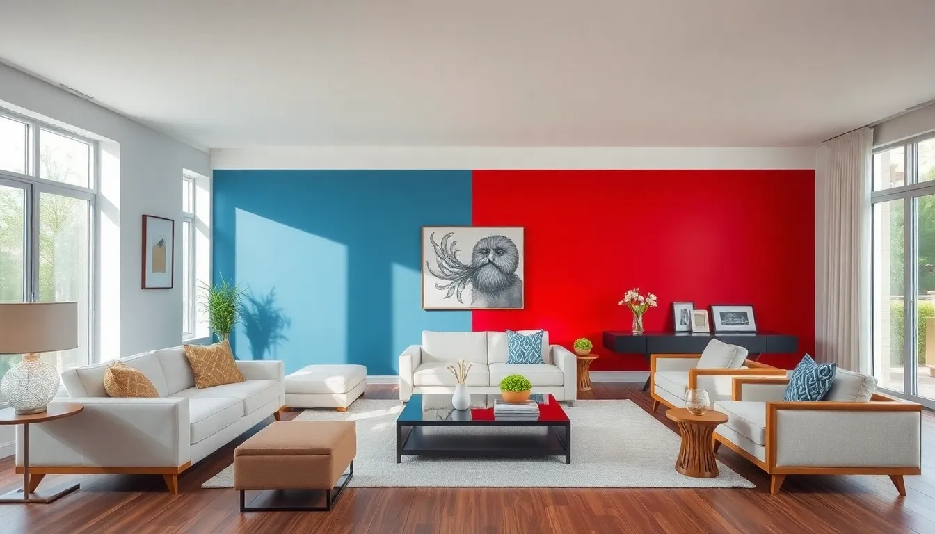
For instance, blue often brings a sense of tranquility, perfect for unwinding after a long day. On the other hand, red can breathe life and energy into the space, making it ideal for lively gatherings. Understanding these nuances allows homeowners to shape their living room into a sanctuary of comfort or a vibrant social hub, tailored to their lifestyle needs.
Consider this: have you ever walked into a room and instantly felt at ease? Or conversely, felt a sense of dread? Often, it’s the colors at play. Each shade carries its own story and reaction. So, knowing the psychology behind the palette is vital for creating a harmonious living environment.
Factors to Consider When Choosing Colors
Choosing colors isn’t solely about personal preference: multiple factors influence these decisions. The first consideration should be lighting. Natural light can drastically change how a color appears, so it’s best to test samples in different lights before committing.
Next is the size of the room. Lighter shades can open up a small space, making it appear larger than it actually is. Conversely, darker shades create a more intimate feel, making spacious rooms feel cozier.
Existing furniture and decor also play a crucial role. If the living room is filled with warm wood tones, then pairing with cool colors may create dissonance. Finally, think about the overall purpose of the room. Will it be a family gathering spot, a quiet reading nook, or a vibrant entertainment area? Understanding its primary function can guide color choices that enhance that specific ambiance.
Popular Color Palettes for Living Rooms
Now that the foundation is set, let’s explore some popular color palettes that resonate well in living rooms. Each palette can set a distinct mood and cater to different tastes. Choosing one can simplify the entire decorating process.
Warm Colors: Inviting and Cozy
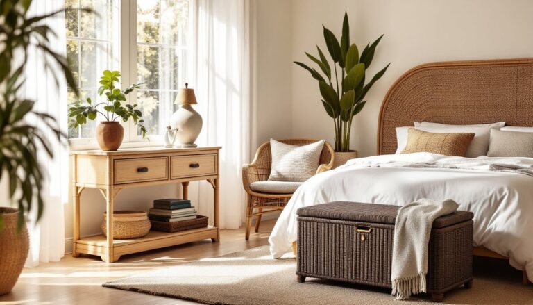
Warm colors like reds, oranges, and yellows create inviting atmospheres. They promote feelings of warmth and comfort, making them ideal for family rooms where connections blossom over board games and movie marathons. Terracotta, for example, exudes a sense of earthiness, while a bold mustard yellow can energize the space, providing a sunny backdrop that keeps spirits high.
Cool Colors: Calm and Serene
Cool colors like blues, greens, and violets are excellent for fostering serenity. They can transform a living room into a serene escape, perfect for reading or meditative moments. A soft aqua can mimic the tranquility of the sea, while a gentle sage green connects the indoor space to nature, promoting relaxation.
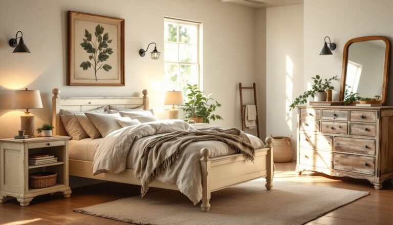
Neutral Colors: Versatile and Timeless
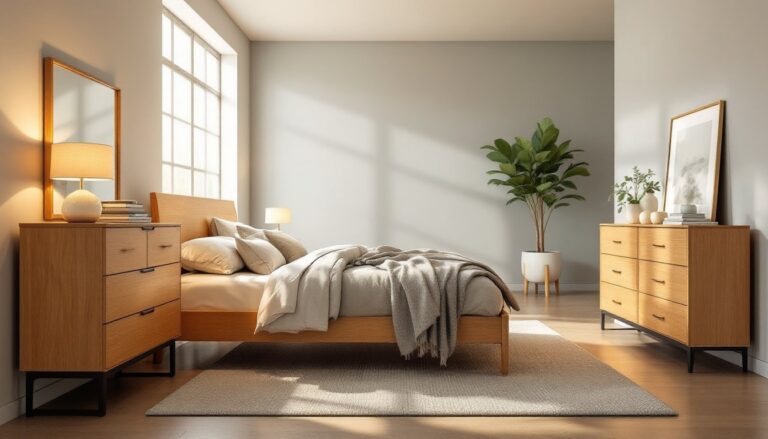
Neutral colors, such as beiges, whites, and grays, offer a versatile canvas. They provide a timeless foundation, allowing homeowners to layer textures, patterns, and colors without overwhelming the senses. An elegant soft gray can act as a sophisticated backdrop for colorful accents while still feeling warm and inviting.
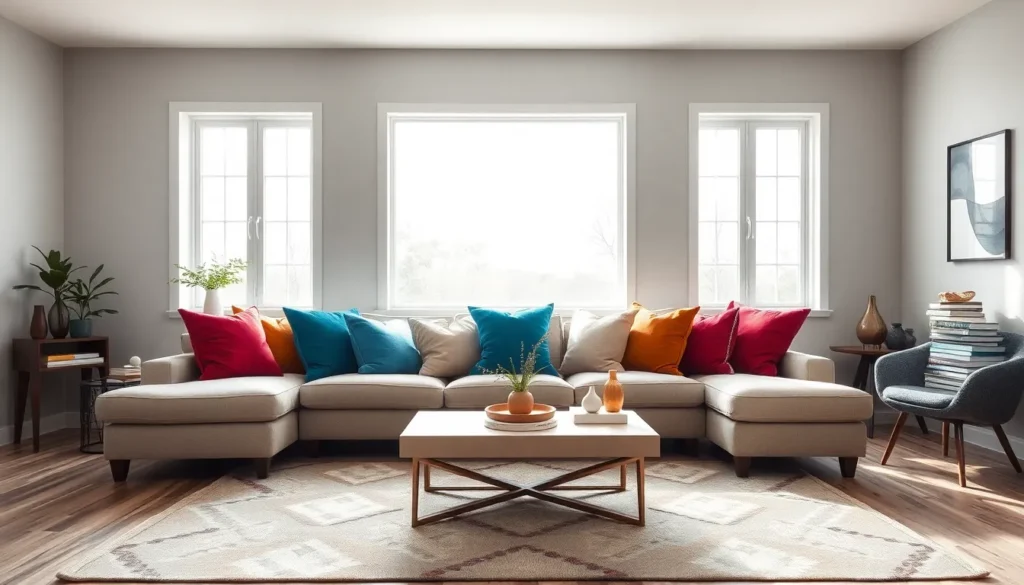
Accent Colors: Adding Depth and Interest
Accent colors breathe life into your primary palette, adding depth and interest to the living room. Consider throw pillows, artwork, or an area rug in vibrant hues like electric blue or fiery red. These bursts can set the tone of the room, guiding attention and creating focal points without requiring a complete overhaul of the chosen color scheme.
Incorporating metallic accents like gold or silver can also elevate the sophistication of the space. Accents are a great way to introduce fun, trendy colors that may not serve well on walls or large pieces but can add personality in smaller doses.
Tips for Harmonizing Colors in Your Space
Harmonizing colors requires a good eye and a little planning. First, consider employing the 60-30-10 rule: 60% of the primary color, 30% of a secondary shade, and 10% for accents. This creates balance and visual appeal.
More than just ratios, the combination of textures and patterns can make a big difference. Mixing materials, think smooth cushions with a textured throw, adds dimension, preventing the space from feeling flat.
Finally, don’t forget about trends. While keeping a timeless aspect is essential, integrating a trendy color or two can keep the living room feeling fresh. Always leave room for art, plants, or other decor pieces to maintain a vibrant atmosphere that reflects personal style.